As I have been so immersed in the renovation of my flat, I remember every nook and cranny and every change that has taken place in great detail. Its evolution has been my passion for over 18 months and its finished state is my pride and joy.
On my last trip to Bute, I welcomed Fiona from Bute Property into my flat to see the finished result. As the person who sold me the flat and remembered its previous state, she was absolutely delighted with its rejuvenation. With the original online brochure printed out for us to compare and contrast, we both marvelled at the transformation.
I still remember the first time I opened the door and viewed my purchase. I was struck initially by two things - the hideous red carpet and the magnificent views. I knew that the red carpet could be easily removed and that the views could also easily become the focal point for each room. I had a very strong vision in my mind about how I wanted the flat to look - and the final result is even better than I could have imagined.
Many of my friends have asked me to post up the before and after photos of each room. And although I studied the online photos with enormous zeal before buying the flat, I realise that not everyone remembers its original state like I do.
So, with no further work to be completed (sing hallelujah!) on the flat, it is now time to do a bit of a compare and contrast study of the before and after pics. Some of the photos are from the original brochure (they are a little blurry as a result) and some are from my very first visit. Not surprisingly, the professional photos from Bute Property showed the flat in its best possible light.
Second bedroom
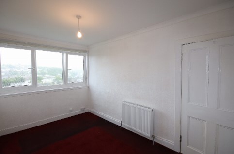
The second bedroom was renovated specifically with my kids in mind. Originally this room had two pieces of furniture in there - a "built in" wardrobe and a small chest of drawers. These were both removed, along with the carpet and the textured wall paper.
With freshly plastered walls painted sage, new windows, new flooring and new lighting, this room has a completely different feel now. The new beds pair beautifully with a second hand dresser sourced in Rothesay and the beautiful navy wool blind and grey sheepskin rug keep it super cosy.
Before
After
Bathroom
This was probably one of the biggest transformations, as the original bathroom was very unappealing. It had a large bath - which unfortunately had been ruined with a paint job using standard wall paint (not easy to detect in photos!). There was also an electric shower (not exactly a power house when it comes to water flow) and a large, awkward cupboard for the boiler. The windows were frosted and you could not see the view at all. It felt very cold and unwelcoming.
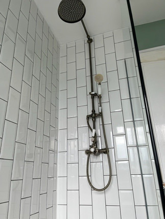
Although I would have loved a small bath in there, that was not to be. Instead there is a big focus on the view with new windows, a clear (& very large) shower with traditional fittings and subway tiles. The boiler was transferred into the kitchen, freeing up a lot of space and the view! This now feels like a luxurious and indulgent space and I really love it.
Before
After
Kitchen
Looking at the previous kitchen, I had wrongly assumed that it would need little to no work from the photos. Unfortunately, the kitchen had not been installed properly and there was mould behind the cabinets and a lot of the tiles were cracked. Even though I was disappointed at the work (& expense) that was required, I do love the final outcome.
The view has been maximised once more, with a kitchen bench under the window and two comfy stools hidden underneath. Navy cabinets with oak countertops provide a lovely contrast with the exposed brick slip tiles. With the boiler now located in the kitchen, that is now the only cabinet above the countertops, to ensure the view is maximised. It is cosy, warm and very functional too. This is my favourite place to write and work when I am there.
Before
After
Main bedroom
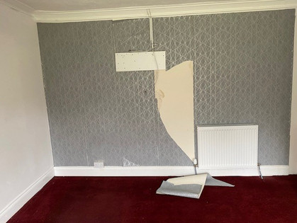
This bedroom was in desperate need of TLC! It had a dodgy shelf and mirror in there, along with that awful red carpet and the same textured wall paper. But if nothing else, it had a reasonable amount of space and incredible views. It wasn't too difficult to make a huge impact in this room and it is now a truly beautiful place to sleep. This room also has my very first purchase from For Bute for the flat - the beautiful Victorian antique dresser. The navy wool curtains, chandelier and sheepskin rug give it a very glamorous feel.
Before
After
Lounge and dining room
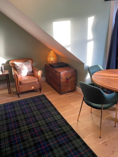
This would have to be one of my favourite places in the flat. It is deceptively larger than it initially looked and there is plenty of space to entertain. But the real gem of this room is the original fireplace that was discovered during the renovations. With a new wood burner installed, it is a lovely nod to the history of the building and beautiful way to keep warm.
The view from this room is also pretty special and changes dramatically with the seasons. There are new windows, new walls that have been plastered and painted, new flooring, dramatic curtains, and some lovely new pieces of furniture blended with pre-loved items from Bute and Glasgow.
Before
After
As I look back at the original state of the flat in my photos and videos, I can't help but smile at my enthusiasm and naivety. Would I have done things differently? Yes, for sure. I learnt a lot during this project and I would definitely approach things in a different way if I had my time again. It took much longer and cost more than I expected and my blind faith in some proved to be foolish - but that was balanced by the generosity and kindness of others.
Would I change the final outcome and my decision to buy my flat? Absolutely not. I knew in my heart that it was the right thing to do and it has brought me enormous happiness and purpose. I absolutely love my trips to Bute, the friendships that I have made, and the connection it has brought to my ancestors and Scottish heritage.
.png)

























Comments